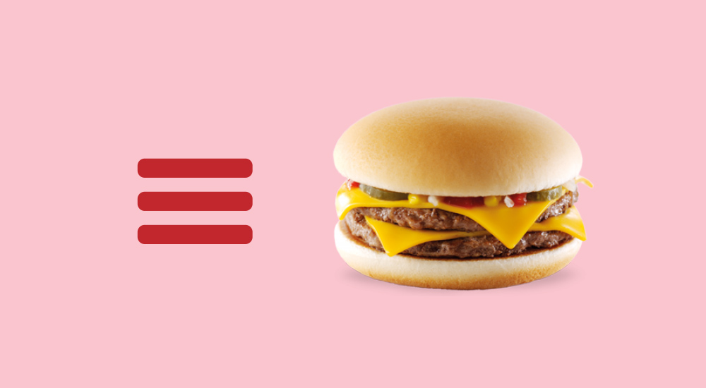
As designers we love to make things as simple and uncluttered as possible. So a few years ago when the ‘hamburger’ menu became more popularised (due to high mobile browsing) I was personally quite excited — as it tidied away all those ‘distracting’ header menus. We even use one on our website!
Now, let me preface this to say – from a UI point of view I LOVE these yummy burger menus, but from a UX perspective it’s a friggin’ nightmare.
To answer my initial question. Can I use a hamburger menu on my Desktop site? The answer is yes, well maybe under the right circumstances.
What are those circumstances?
- A ‘creative’ website that showcases artwork, photography or some complex concept.
- A one page website that doesn’t really need the user to navigate between pages.
- If you really feel you need some ‘snazzy’ interactive feature to help differentiate the website. (But just don’t expect the user to stick around).
Header navigation is really important and sometimes an overlooked part of the site-mapping process. I have been given briefs to start a website design without knowing how many items or at least what kind of items would appear in the main navigation. In a quick glance the user can see what is important to this company, depending what words are in your navigation. I like to make some of the words interesting ie: the word ‘Hello’ instead of ‘Home’ (Depending on the tone of your website copy). This train of thought should probably lead me to write another post, do I need a ‘Home’ button anymore?
Final tip, if you really feel like simplifying your header nav, you could use the word ‘Menu’ or an arrow icon instead of the 3 lines. At least this might inspire the user to click on the word to see what else your website offers them.
Keep it simple stupid, ok not too simple.


